HEAT Map
In one of my previous ggplot post, I gave some insight on line, point, bar chart. Lets try to generate heat map using ggplot library. To begin with, I am using below libraries
library("ggplot2")
library("scales")
library("reshape2")
ggplot has no special syntax for heatmap, it uses combination of geom_title and scale_fill_gradient to plot heatmap. Lets try to plot simple heatmap. I am using IPL 2014 top 50 run score data.
ipl.m=melt(ipl)
ipl.d <- ddply(ipl.m, .(variable), transform, rescale = rescale(value))
ggplot(ipl.d, aes(variable, Player)) + geom_tile(aes(fill = rescale), colour = "white") + scale_fill_gradient(low = "white", high = "steelblue")

Above heatmap is raw, Lets try to beautify the same heatmap.
ggplot(ipl.d, aes(variable, Player)) + geom_tile(aes(fill = rescale), colour = "white") + labs(x = "", y = "") + scale_x_discrete(expand = c(0, 0)) + scale_y_discrete(expand = c(0, 0)) +
theme(legend.position = "none", axis.ticks = element_blank(), axis.text.x = element_text(angle = 45, hjust = 1, face="bold", size=15), axis.text.y = element_text(face="bold", size=9)) + scale_fill_gradient(low = "white", high = "steelblue")
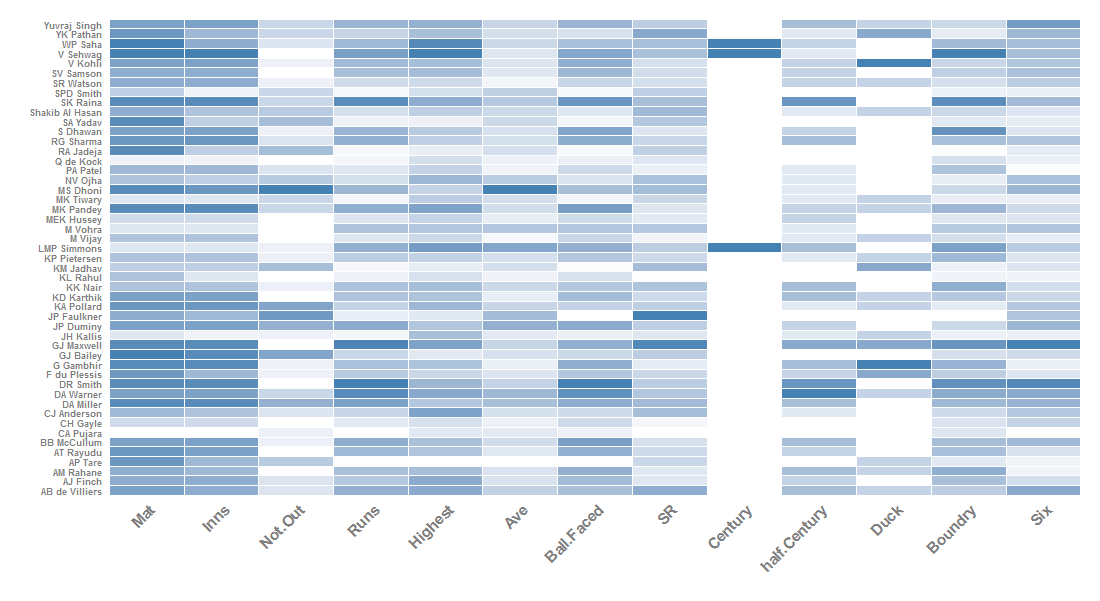
Cricket is a batsman game and I used top 50 run scorer to generate heat map. Below is the heatmap of top 45 bowlers.

PIE Chart
In my previous post, I discussed about how to draw basic pie chart. Lets try to plot pie chart using ggplot2. I am using the same data of my previous post. ggplot has no syntax called pie. It uses coor_polar to draw pie chart.
india_rain=read.csv("rainfall_2014.csv", header=T, sep=",", stringsAsFactors=FALSE)
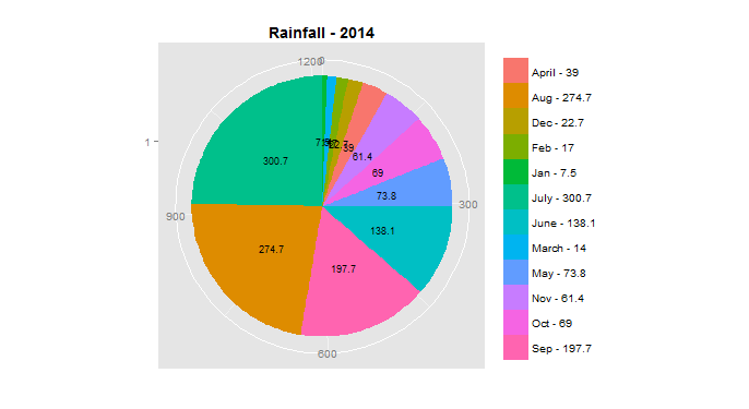
ggplot(india_rain, aes(x=factor(1), rain, fill=as.factor(paste(Months,rain, sep=" - ")))) + geom_bar(stat="identity", width=1) + ggtitle("Rainfall - 2014")+coord_polar(theta = "y")
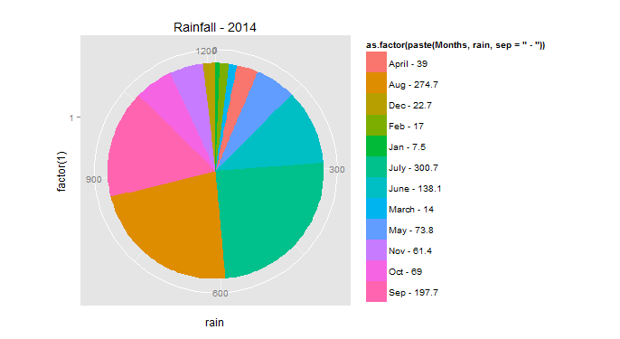
Above pie chart was a basic pie chart we can generate using ggplot. Lets do some beautification.
#To adjust label in pie. This give angle in which pie label display.
india_rain$y = india_rain$rain/2 + c(0, cumsum(india_rain$rain)[-length(india_rain$rain)])
ggplot(z, aes(x=factor(1), rain, fill=as.factor(paste(Months,rain, sep=" - ")))) + geom_bar(stat="identity", width=1) + ggtitle("Rainfall - 2014")+coord_polar(theta = "y")+xlab("")+ylab("")+theme(legend.position="right", legend.title=element_blank(), plot.title = element_text(lineheight=3, face="bold", color="black", size=14))+geom_text(aes(x= factor(1),y=y,label = rain), size=3)